A skull drawn by hand. Letters drawn with a ruler.
CRANEO 3D is my archive of imagined spaces; I am an architect in Mexico. This page sets down how the archive looks and why: the name, the mark, the type, the greys, the light the rooms are made of, and the people who taught me where to look.
The name
Cráneo · skullCraneo is Spanish for skull: the box that holds what I imagine. Every room in the archive was built inside one before it was built in Blender.
The name is written without its accent so it travels. “3D” stays in the address and the handles; the mark itself only says CRANEO.
The mark
One ink
The skull is the original brush drawing, filled: its own edge kept, its inner strokes cut out. The letters CRA / NEO are built with a ruler in Línea Recta, the logo cut, and pushed back at 30°, the same angle as the cube of the skull.
- 720 px +Full mark with contours
- 80–720 pxFlat word
- Below 80 pxSkull alone
- 32 · 16 pxFavicon cut


Type
Inter Tight for titles · Recta for the logo · Plex Mono for dataNOPQRSTUVWXYZ
abcdefghijklm
nopqrstuvwxyz
0123456789
ÁÉÍÓÚÜÑ ¿?¡!&@#%
Inter Tight is the title letter of the archive: sober, close-set, editorial. Bold for the largest titles, SemiBold for every other title, Medium for the quiet half of a line. Designed by Rasmus Andersson, released under the SIL Open Font License. Tektur stays with the live, informal side of the studio.
Línea Recta is the logo cut. It builds CRA / NEO and sets the name CRANEO 3D, and stays there.
IBM Plex Mono carries the data: codes, dates, sizes, light, emails and links, from 13 to 40 px. Codes larger than that are set in Inter Tight. Long reading stays in IBM Plex Sans.
Colour
Six greys · colour belongs to the works#E6E8E4
#CBCFCB
#A9ABA7
#8D938F
#54575A
#1E2022
The greys come from Vilhelm Hammershøi’s rooms: green-grey walls, blue-black doors. They frame the renders without competing with them.
Colour belongs to the works. The site, the print sheets and every piece around a room stay grey, paper and ink, so nothing stains the colour a room has earned with its own light and materials.
There is no accent colour, no colour per series and no colour for launches. On anything for sale, one small square signs the archive code: ink on light grounds, paper on ink.
Graphic language
Drawn like a planThe archive code
CRNEvery work, view, print and scene carries one code. The number never changes, even if the image is revisited.
- WorkCRN-0005 · Ochre Study
- ViewCRN-0005-B · -C
- PrintCRN-0005 · ED 01/30 · 50×50
- SceneCRN-S001
- KitCRN-K001
Light
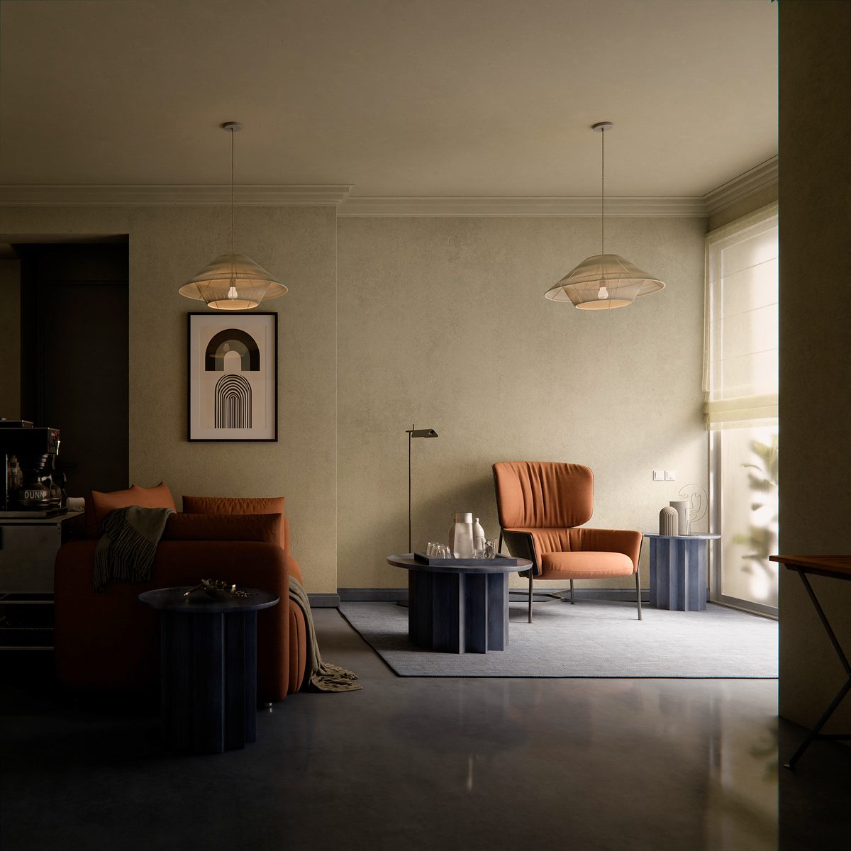
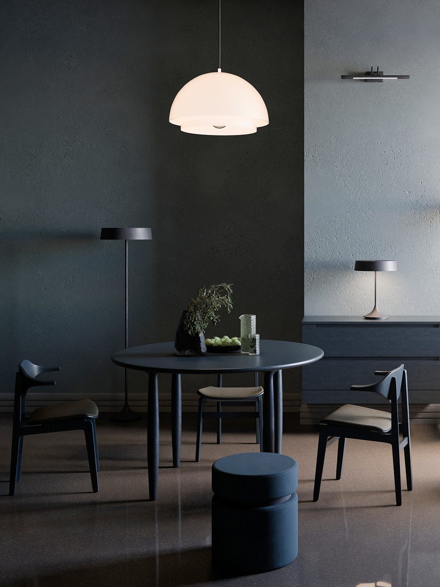
What every room is made of- One lightA single direction, long and soft. The rest of the room answers it.
- Open shadowDrama without closed black: form stays readable inside the dark.
- RestSoft textures and visual comfort. The eye should be able to rest.
- MaterialWood grain, stone and lime hold the darkness; texture replaces detail.
- Colour per workNone, one or several colours, each earned by the architecture, never assigned.
Influences
Teachers, not models- Architecture
- Luis Barragán, for colour in Mexican light.
- Painting
- Vilhelm Hammershøi, for empty rooms that still feel inhabited.
- Design
- Dieter Rams and the Swiss grid, for the discipline of less.
Principles
Made to lastLess, but better.
Honest, but warm.
Systematic, but melancholic.
Made to last.